Page 1 of 4
Back In The Book ...
Posted: Fri Feb 03, 2012 12:26 am
by Amskeptic
Daunting and frustrating and the publishing industry is not kind to those of us who want to have almost 300 pages of high quality color illustrations that trap the text and the layout like a concrete bunker, there is no editing. High quality 300 page fully illustrated books with extra inks like hexachromatic yellow, seem to be around $80.00 my cost.
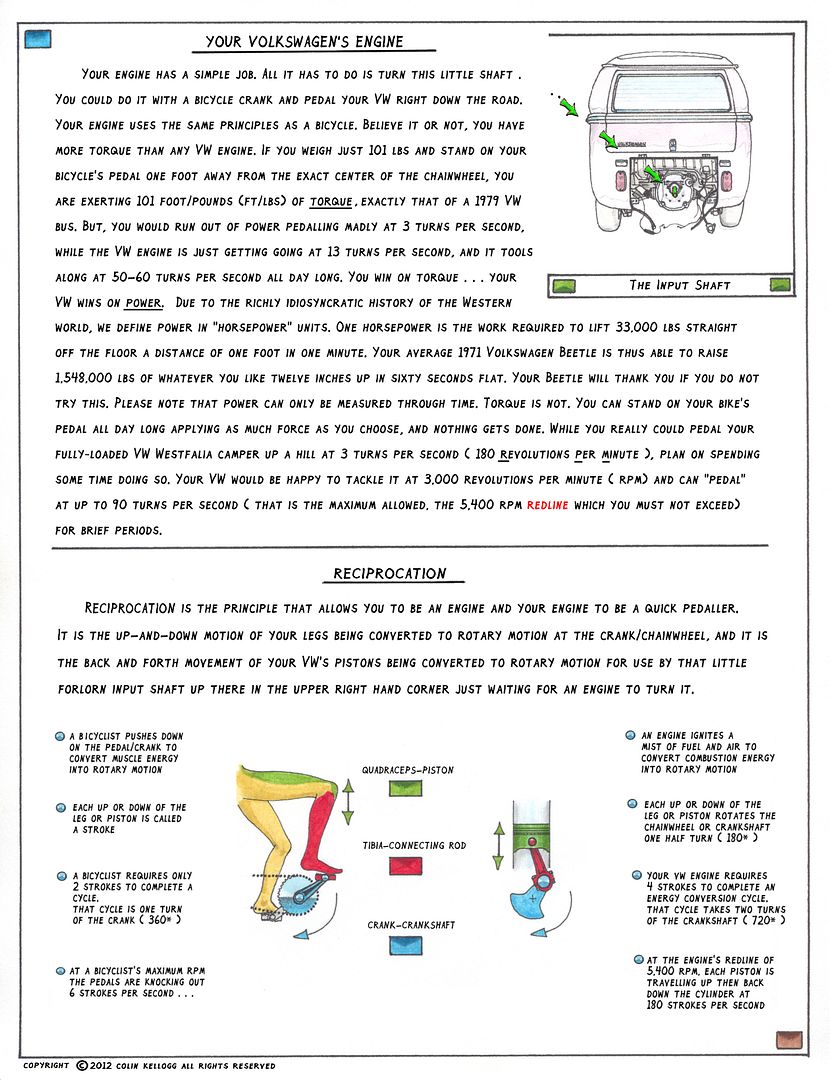
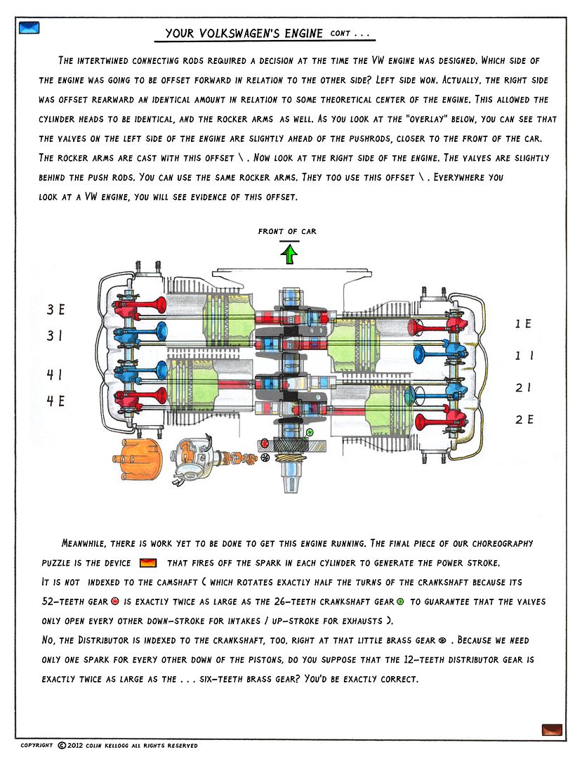
So, with the first half almost done, I have been going back laboriously and using Paint.Net to clean off the hand-written text, and try to type in this font that is my own handwriting (now in the computer font folder). It has its own ideas about spacing and I have mine. So I have had to do some updates like "by the way, my bus got killed", and do some major cleaning up and revising of the flow of information.
Here is a sample:

I do like the flexibility of being able to repair mis-spellings without throwing out the whole page like I used to ... man, I can't believe I am so stubborn when it comes to catching up with all you modern WORD-PROCESSOR types ...
ColinBusyTilForever
Re: Back In The Book ...
Posted: Fri Feb 03, 2012 6:11 am
by sped372
Are you familiar with kerning?
Re: Back In The Book ...
Posted: Fri Feb 03, 2012 7:35 am
by Amskeptic
sped372 wrote:Are you familiar with kerning?
Why no.Care to e l a b o r a t e ?
Colin
Re: Back In The Book ...
Posted: Fri Feb 03, 2012 8:26 am
by Bleyseng
In typography, kerning (less commonly mortising) is the process of adjusting the spacing between characters in a proportional font, usually to achieve a visually pleasing result. Kerning is the adjustment of the space between individual letter forms vs. tracking which is the uniform adjustment of spacing applied over a range of characters.[1] In a well-kerned font, the two-dimensional blank spaces between each pair of characters all have similar area. The related term kern denotes a part of a type letter that overhangs the edge of the type block.
Re: Back In The Book ...
Posted: Fri Feb 03, 2012 12:36 pm
by jonyem
To add to the talk about kerning, A good typeface with proper kerning can make all the difference between a book that is enjoyable to read, and one that just sits on a shelf. If you're moving away from the handwritten to the typed may I suggest also moving away from ALL CAPS? The hand done version looks quite good, but the typed version could become obnoxious over the course of the reading experience.
Re: Back In The Book ...
Posted: Fri Feb 03, 2012 1:04 pm
by dingo
i agree about eliminating the ALL CAPS..too overbearing and tiresome on the eye to read
Re: Back In The Book ...
Posted: Sat Feb 04, 2012 12:26 pm
by jonyem
It may just be my type snobbery that made me comment in the first place, but the look is starting to appeal to me. I do prefer the handwritten over the mechanical font, but bottom line is making the best book you can, with the resources available to you and your printer/press.
Anything original is going to be jarring at first. I say continue as you are.
Re: Back In The Book ...
Posted: Sat Feb 04, 2012 4:12 pm
by sped372
I like the 2010 one personally, but the differences between the fonts wouldn't prevent me from buying a copy.
Re: Back In The Book ...
Posted: Sat Feb 04, 2012 6:53 pm
by Amskeptic
sped372 wrote:I like the 2010 one personally, but the differences between the fonts wouldn't prevent me from buying a copy.
Thank you all for your feedback. As I learn how to use this program, I am finding that great flexibility is available. I look at the hundreds of rejected pages in the "rejected pages" file, and I am sort of mortified at:
*the hundreds of hours that they all represent,
*my utter ignorance that my eyesight and fine motor coordination was only a temporary gift,
*the prison I had put myself in as far as major edits being impossible by having to re-do major subset pages by hand.
But, this is the prettiest manuscript (up to page 78) ever.
And it is going to be the ugliest bunch of haphazard drawings and orphaned text files going forward, however the completed TIFF files look sharp.
Colin
Re: Back In The Book ...
Posted: Wed Feb 08, 2012 4:07 pm
by nathan@el
I would gladly pay $80 for your book once it is finished, and I am sure many, many other people on IAC and in the VW community would as well. I'm looking forward to the day when I can hold a copy of this in my own two hands.
Re: Back In The Book ...
Posted: Wed Feb 08, 2012 4:44 pm
by hambone
$80 is beyond the spirit of the book and the current economic climate. There must be a way to do it cheaper.
Re: Back In The Book ...
Posted: Wed Feb 08, 2012 11:50 pm
by Amskeptic
hambone wrote:$80 is beyond the spirit of the book and the current economic climate. There must be a way to do it cheaper.
That is what the bean counters said when they gutted the beautifully crafted air-cooled VWs after Heinz Nordhoff died. Yes, you can do it cheaper. But I need to defend the color as far into the process as humanly possible.

Re: Back In The Book ...
Posted: Wed Feb 08, 2012 11:55 pm
by Xelmon
Yeah... No way that would fly in black and white.
Go with color. Make it a beautiful working book.
Re: Back In The Book ...
Posted: Thu Feb 09, 2012 4:59 am
by thesamwise4
Xelmon wrote:Go with color. Make it a beautiful working book.
Totally agree on both counts.
The pages you've posted look great.
Way to get it done, Colin.
Re: Back In The Book ...
Posted: Thu Feb 09, 2012 10:19 am
by JLT
I feel for you, Colin. I just went through something of the same process when I converted a book of mine into an eBook. I had to re-do most of the graphics and accept some compromises in layout and fonts to accommodate the new format. I reassured myself with the thought that most people buy books for content, not form.
In your case, however, the content IS the form, so you have it harder than me. But rest assured that fonts don't really matter much, as long as the illustrations come through. Any clear, legible font will work just fine. In fact, the "busier" the font is, the more it distracts from the illustrations. The best font, like the best movie music, enhances without the viewer even noticing that it's there.
